Reimagining Prolicious’ digital experience around the way people actually eat.

Client

Prolicious

Industry

Food & Nutrition / D2C

What we did

UI/UX Design

Web Development

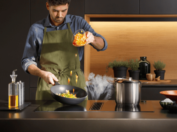
Protein is often presented as a separate behaviour. Shakes, supplements, bars and fitness-focused routines. Prolicious had a different proposition. It wanted protein and fibre to belong at the everyday dining table: in roti, dal, dosa, smoothies, snacks and family meals. The challenge was therefore bigger than creating a visually appealing website. The digital experience had to make a new category proposition feel familiar. Food first. Nutrition second. The brand's core positioning was built around quietly upgrading everyday meals with better nutrition, while keeping familiar food and habits intact.

Client

Prolicious

Industry

Food & Nutrition / D2C

What we did

UI/UX Design

Web Development

Challenges

Making protein feel like everyday food

Protein was associated with gyms, shakes and supplements. Prolicious needed to make protein and fibre feel natural within familiar Indian meals.

Upgrading habits without changing them

Prolicious needed to show how its products fit seamlessly into existing meals while making usage, nutrition and taste easy to understand.

Conversion Friction

The website had to turn product discovery into a clear purchase decision, reducing hesitation around what to buy, how to use it, and why it fits into everyday meals.

Solutions

Food-first experience

We shifted the focus from protein to familiar food, showing how Prolicious naturally fits into everyday meals.

Routine-led discovery

Products were organised around everyday eating occasions, helping users find relevant products through breakfast, lunch, snacks and dinner.

Four category-specific templates

We created distinct visual templates for Breakfast, UP IT, Snacks and Pantry, giving each category a unique look and content structure while maintaining a consistent Prolicious experience.

Contextual product storytelling

We showed products in use through meals and recipes, making it easier to understand what they are, how they work and where they fit.

Simple nutrition communication

Protein, fibre and taste benefits were presented clearly without making the experience feel clinical or supplement-led.

Consistent visual system

We translated the Prolicious brand into a cohesive digital language using food-led imagery, the smile asset, Besties, icons and a warm, premium visual style.

Performance Outcomes

Business Impact

+104% increase in revenue, demonstrating stronger commercial performance during the measured period.

Purchase Intent

A substantial increase in checkout activity indicated stronger movement through the purchase journey.

Commercial Performance

Revenue growth demonstrated the broader business impact of the redesigned digital experience.

Banner Image

Final user interface

We revamped the Prolicious digital experience to make the brand more food-first, intuitive and conversion-focused. The new experience simplifies product discovery, communicates nutrition clearly and shows how Prolicious fits into everyday meals. From the homepage and product discovery to PDPs, recipes and checkout, every touchpoint was redesigned to make the everyday upgrade easier to understand and act on.

Results

Business Impact

+104% increase in revenue, demonstrating stronger commercial performance during the measured period.

Purchase Intent

A substantial increase in checkout activity indicated stronger movement through the purchase journey.

Commercial Performance

Revenue growth demonstrated the broader business impact of the redesigned digital experience.

1.58X
increase in product engagement through add-to-cart actions
7X
increase in checkout intent across the purchase journey
26X
increase in conversion rate, reflecting improved journey completion

Ready to unbundle greatness?

Web Development
Shopify Migration
Social Media
SEO
UI/UX
Performance Marketing
Custom App Development